The E-commerce Blog
How to Optimise Your E-commerce Website for Mobile Users
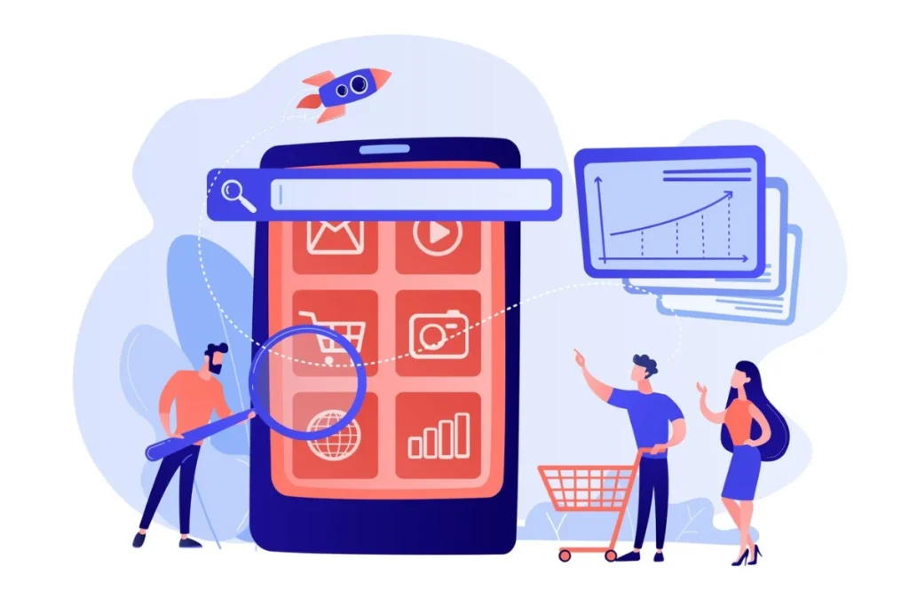
In today’s digital age, mobile commerce is growing at an unprecedented rate. More people are shopping on their phones and tablets. So, making your e-commerce site mobile-friendly is essential, not optional. Optimising mobile e-commerce is key. It improves user experience, boosts conversions, and keeps you competitive. A website not optimised for mobile users can lead to high bounce rates, lost revenue, and poor customer satisfaction.
This guide helps you optimise your e-commerce website for mobile users. You’ll learn to improve navigation, speed up load times, and enhance the shopping experience.
Core Concept: Why Mobile E-commerce Optimisation Matters
Mobile commerce (m-commerce) is projected to account for a significant portion of online sales globally. According to recent studies, mobile transactions are growing at a rate that surpasses desktop sales. This shift highlights the importance of responsive design and a seamless mobile user experience.
Key Benefits of Mobile Optimisation:
- Better User Experience: A mobile-optimised site makes browsing easy. It cuts down frustration and boosts engagement.
- Higher Conversion Rates: A smooth checkout process and easy navigation help users finish their purchases.
- Improved SEO Rankings: Google prioritises mobile-friendly websites, improving your search visibility.
- Lower Bounce Rates: A fast-loading, mobile-optimised site keeps visitors engaged, reducing abandonment rates.
- Boosted Customer Retention: A smooth mobile shopping experience builds brand loyalty and encourages repeat buys.
Quick Guide: Steps to Begin Mobile E-commerce Optimisation
- Ensure a Responsive Design: Use a mobile-first approach to ensure your site adapts to various screen sizes.
- Optimise Loading Speed: Compress images, enable caching, and minimise unnecessary scripts.
- Simplify Navigation: Use intuitive menus, clear call-to-action buttons, and a streamlined layout.
- Enhance Mobile Checkout: Offer guest checkout, auto-fill options, and multiple secure payment methods.
- Improve Mobile Search & Filtering: Implement smart filters, voice search, and AI-powered recommendations.
- Use High-Quality, Optimised Images and Videos: Use next-gen formats like WebP. Also, enable lazy loading.
- Leverage Mobile-Friendly Features: Enable push notifications, AI chatbots, and thumb-friendly design elements.
- Test & Monitor Performance: Regularly check how responsive your site is. Use tools like Google’s Mobile-Friendly Test and PageSpeed Insights.
Pro Tip: Ensure your website loads within three seconds on mobile devices to reduce bounce rates and improve user engagement.
Step-by-Step Guide to Mobile E-commerce Optimisation

1. Implement a Responsive Design
Ensure your website is built using a responsive design framework. This allows your site to adapt dynamically to different screen sizes. It provides a consistent experience across all devices.
- Use flexible grids and layouts to accommodate various screen sizes.
- Ensure images and media resize proportionally without losing quality.
- Test your site’s responsiveness using tools like Google’s Mobile-Friendly Test.

2. Optimise Page Load Speed
Speed is a critical factor in mobile user experience. Slow-loading pages can drive potential customers away.
- Compress images using tools like TinyPNG or JPEG Optimizer.
- Enable browser caching and minify CSS, JavaScript, and HTML.
- Use a Content Delivery Network (CDN) to reduce load times globally.
- Implement accelerated mobile pages (AMP) for lightning-fast performance.
3. Simplify Navigation for Mobile Users
A complex navigation structure can frustrate users. Keep things simple and intuitive.
- Use a hamburger menu to save space while maintaining easy access.
- Prioritise essential pages such as categories, cart, and contact information.
- Implement breadcrumb navigation for better usability.
4. Mobile-Friendly Checkout Process
A cumbersome checkout process leads to cart abandonment. Streamline the process to enhance conversions.
- Offer guest checkout options to reduce friction.
- Enable auto-fill and saved payment methods.
- Use one-page checkout to speed up the transaction process.
5. Enhance Mobile Search and Filtering
Shoppers expect a seamless search experience. Optimise your search functionality for mobile devices.
- Implement an AI-powered search bar with autocomplete suggestions.
- Enable voice search capabilities for hands-free convenience.
- Provide smart filters to help users refine their search results quickly.
6. Optimise Images and Videos for Mobile Viewing
High-quality images and videos improve engagement, but they must be optimised for mobile.
- Use next-gen formats like WebP to reduce file size without compromising quality.
- Implement lazy loading to ensure images load only when needed.
- Provide mobile-friendly video content that supports tap-to-play functionality.
Important: Test your mobile e-commerce site on different devices and screen sizes. This ensures a smooth experience for every user.
Advice for Mobile E-commerce Success
- Enable Mobile Push Notifications: Engage users with personalised offers and alerts.
- Leverage AI Chatbots: Provide instant customer support to mobile shoppers.
- Use Heatmaps: Analyse user behaviour to identify pain points and improve usability.
- Ensure Thumb-Friendly Design: Place essential elements within easy reach for one-handed use.
- Incorporate Social Proof: Display mobile-friendly reviews and ratings to build trust.
Things to Consider
- Security Concerns: Ensure SSL certificates are active and implement secure payment gateways.
- Compatibility Testing: Regularly test your website on multiple mobile devices and browsers.
- Legal Compliance: Adhere to GDPR, CCPA, and other privacy regulations for mobile users.
- Avoid Intrusive Pop-ups: Google penalises sites with intrusive interstitials on mobile.
Best Practices & Additional Insights
- Regular Performance Audits: Use tools like Google PageSpeed Insights to track and improve performance.
- Mobile-Specific Promotions: Run exclusive mobile discounts to encourage app and mobile web engagement.
- App Integration: If needed, think about creating a progressive web app (PWA) to improve user experience.
- Personalisation: Use AI-driven recommendations to offer personalised product suggestions.
Warning: Not making your site mobile-friendly can cause more people to leave their carts. This can lead to a big loss in possible sales.
FAQs: Mobile E-commerce Optimisation
Why is mobile optimisation important for e-commerce?
Mobile optimisation makes for a smoother user experience. It boosts SEO rankings, lowers bounce rates, and raises conversions.
What is responsive design, and why does it matter?
Responsive design allows a website to adjust dynamically to different screen sizes. This ensures usability across various devices.
How can I check if my e-commerce site is mobile-friendly?
Use tools like Google’s Mobile-Friendly Test and PageSpeed Insights to evaluate your site’s mobile performance.
What are some common mistakes in mobile e-commerce design?
Common mistakes include slow page speeds, cluttered layouts, difficult navigation, and intrusive pop-ups.
How can I improve my mobile checkout experience?
Make checkout easier by adding guest checkout, auto-fill features, and quick, secure payment options.
Does mobile optimisation affect SEO rankings?
Yes, Google uses mobile-first indexing. This means your site’s mobile experience affects search rankings.
What’s the difference between a mobile website and a mobile app?
A mobile website is a responsive version of your site. A mobile app provides a more immersive, app-based experience. Both can enhance mobile shopping, depending on your business needs.
Stay Ahead: The Key to Mobile E-commerce Success
Optimising your e-commerce website for mobile users is no longer a luxury—it’s a necessity. Use responsive design to improve mobile user experience. This will help increase engagement, conversions, and customer satisfaction. Keep your edge over competitors. Always improve your mobile strategy and adjust to changing consumer trends.
Start optimising today and unlock the full potential of mobile commerce!


YOU MAY LIKE